


Design evolves. So does our identity.
Groël’s new visual identity has been created to reflect more precisely who we are today. An evolution that expresses the way we approach design: clean, precise and considered down to the smallest detail.
 |
 |
 |
This is not about changing direction, but about refining our identity to express more clearly what has always defined us.
An evolution shaped by detail
The new logo retains the Groël name and its essence, while redefining its forms through a more balanced, contemporary and distinctive visual language.
Every line has been reconsidered. The proportions, spacing and relationship between the letters now follow a more precise structure. The result is a clearer, more versatile visual identity, designed to work across different scales, materials and applications.
From digital to print. From flat surfaces to relief. From communication to the product itself.
An identity with a material dimension
Our new identity was not conceived simply to be seen. It was also designed to interact with materials.
Relief, texture, light and shadow give the logo a physical presence. This material dimension connects our new visual language with the world of Groël and with the way we create objects designed to become part of architecture.
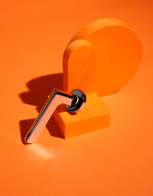
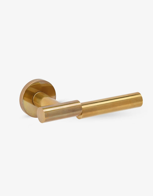
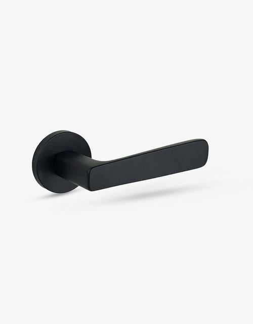
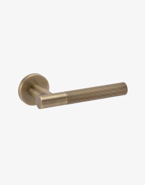
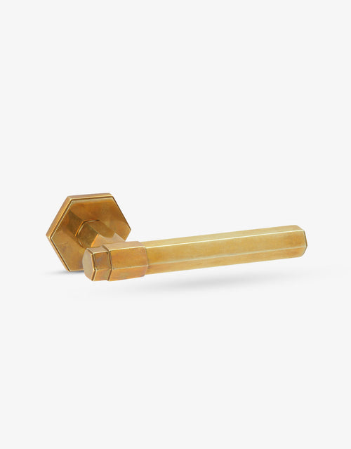
Just as a door handle creates the first point of contact with a space, our identity creates the first point of contact with the brand.
A system for Groël today
Beyond the logo, the rebrand establishes a coherent visual language across every Groël touchpoint: communications, packaging, catalogues, spaces, digital platforms and the presentation of our collections.
A more flexible and recognisable system that supports the evolution of the brand and strengthens its international character, while remaining true to its core values.
A new expression that allows us to move forward while staying true to the same essence.
Design evolves, essence remains.
For the website layout, I would use the metallic image as the hero image, the grid-based composition in the section exploring the logo’s construction, and the card application to close the section dedicated to materiality. The videos could be interspersed throughout the page to show the logo in motion.
